ELLEN DALTON – Hair and Make up Artist Re-Design July 2017
The Challenge
Ellen’s site had firmly established her business over the last 10 years but she now decided that it was time for a change. She wanted something clean and simple and had very clear ideas about the colouring, the images and even the type of font she wanted to illustrate all the services that she offers. Ellen also wanted her site to rank higher in the search engines plus needed a new logo and all of her other linked social media pages to be updated matching the new website.
The Solution
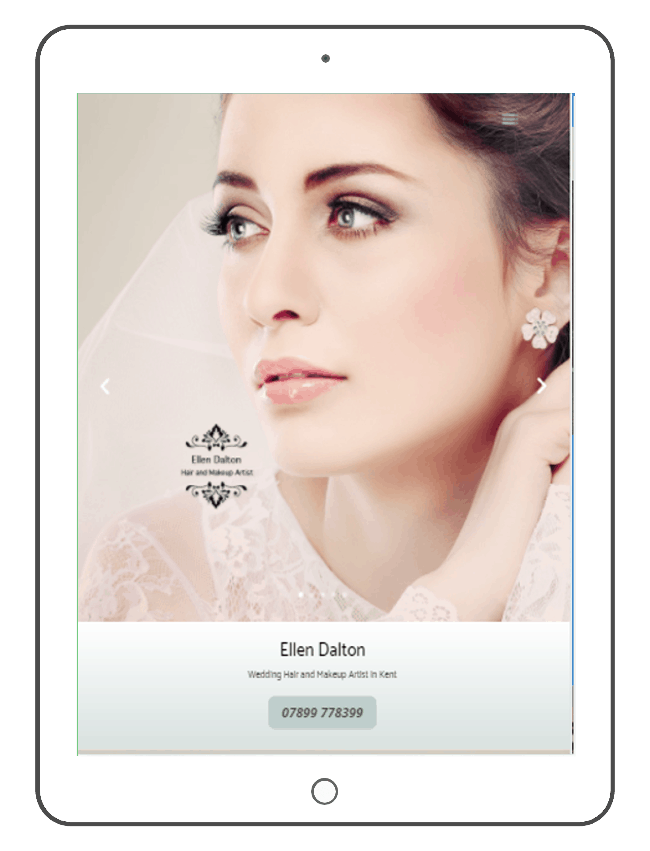
We chose each image very carefully and tried different cover shots until we settled on the one we felt most captured how a client looks after their booking with Ellen. We focused on the bride and the bridesmaids but also highlighted the mother of the bride. We ensured that the gallery had all the pictures relevant to some of the weddings she has covered during her career. We also updated the Facebook, Google and Twitter pages plus illustrated her considerable following on these social media sites.
We Started from scratch
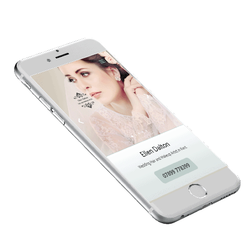
We exchanged ideas and we came up with a template that we amended until Ellen was happy with the result. This was tested on a desktop, laptop, tablet and smartphone devices.
Re-designed Website
%
Customer Reaction
Day Turnaround
Beautiful Result
Every part of this website was designed to create a unique but professional feel
Mobile "FRIENDLY"
Rebuilt From the Inside Out
NEW PAGES
Whatever make of phone you have
Larger Fonts
A business opportunity
See other sites in My PortFOLIO
You may like the look of a my Cycle Shop Website Site or Home Staging Site. Or Maybe you might like the colours on the Tipper Haulage site

